Project Overview
Dual Brand Loyalty Redesign
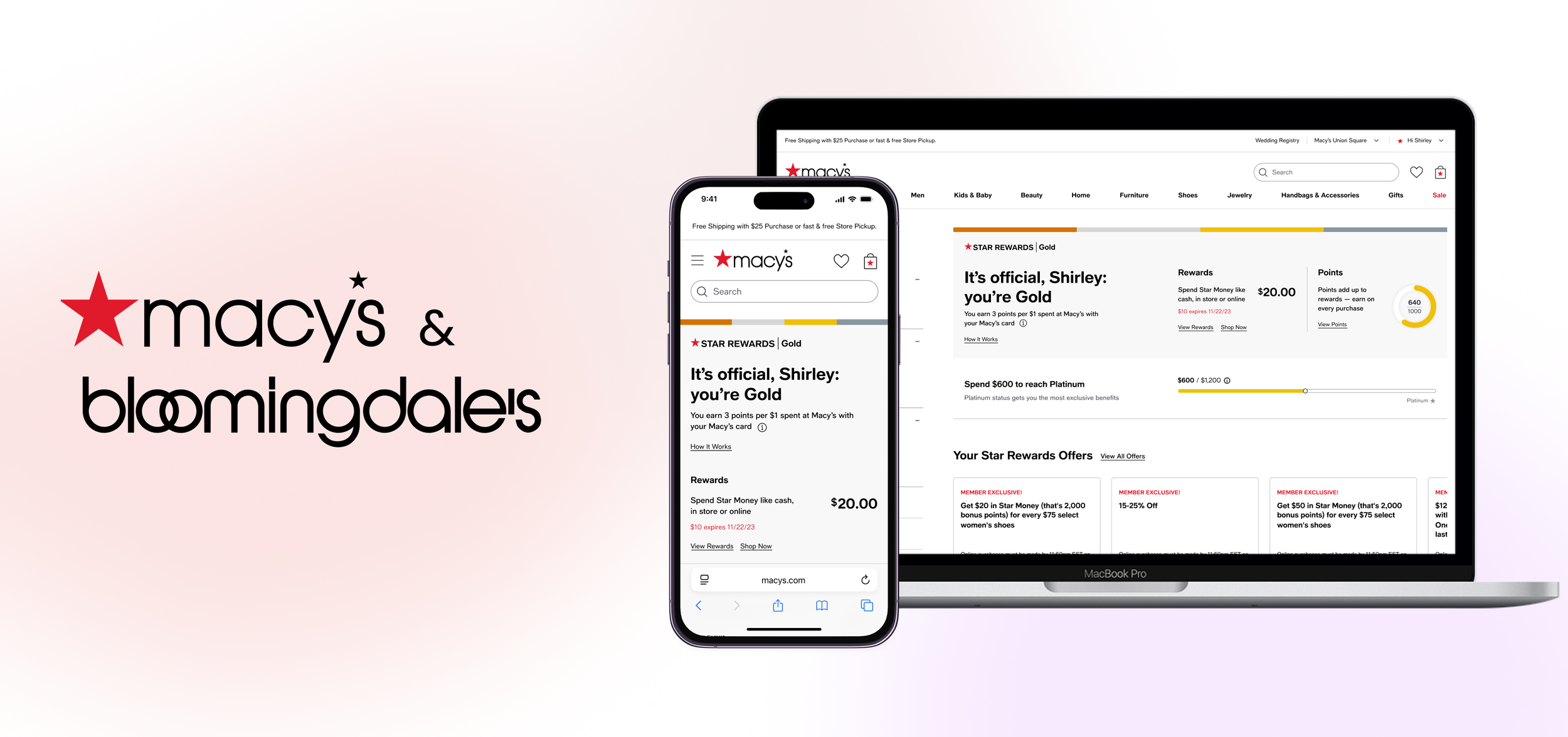
With Macy’s and Bloomingdale’s longstanding history, both department store’s loyalty programs are ripe for a modern update. Refreshing their interfaces is crucial to each brand's success, particularly in attracting and retaining dedicated shoppers.
Duration: 6 Months
Methods: Interviews, Wireframes, Prototyping, Usability Testing
Tools: Figma
the Problem
How can we effectively educate and empower users to make the most of the benefits provided by our Loyalty Programs?
Based on our user research studies, we have identified a significant challenge: Macy’s and Bloomingdale’s customers don’t understand what benefits are available to them and how to extract the most value from their membership. Nor does it feel special or engaging.
We identified three main problems from a user’s perspective:
When or where do I see my next reward or tier?
I don’t even know what benefits I get!
Where do I find my discounts?
Current State
Antiquated, convoluted, & unfriendly
At first glance, our Macy’s Star Rewards page needs an update. The page is difficult to navigate due to an outdated double left navigation. The content lacks a hierarchy that considers user needs, making it hard to pinpoint important information.
On Bloomingdale’s, information about the Loyallist program is spread throughout 5 pages. Like its Macy’s counterpart, the page layout does not consider the user’s goals and priorities.
Both pages need an organizational update that informs and celebrates each user’s brand loyalty.
user research insights
Macy's and Bloomingdale's shoppers often struggle to locate their loyalty status and understand how to leverage its benefits.
Upon reviewing the UXR synthesis provided by our UX researchers, it became clear that the page contents could be categorized into two groups: dynamic and informational.
primary focus
Theme 1: Dynamic
User’s tier and reward status including how far they are from the next tier, how far they are from the next reward, and how to take action on expiring rewards
Promotional events and benefits including bonus point days, Star Pass discounts, available rewards, and birthday rewards
Reminders about opportunities to earn points faster like Star Money Bonus Days and Loyallist bonus point days
Secondary focus
Theme 2: Informational
Program mechanics including the user’s point earn rate and a summary of how to turn points into rewards
Non-point related member benefits like birthday gift, free shipping, exclusive discounts
Tier Breakdown so users may understand their benefits relative to the other tiers
improvements & final product
Figma Final Prototype
After creating initial wireframes guided by the themes learned from our UXR, my team and I gathered multiple rounds of feedback from UX and Product leadership and each loyalty program’s business and marketing teams.
I faced challenges navigating uninformed stakeholder feedback that contradicted meticulously conducted UX research during this project. These conflicting viewpoints often create a dissonance between what users truly need and what stakeholders perceive as valuable. In defending my team’s designs for this project, I learned the importance of effective communication, education, and advocacy for user-centered design principles within the organization to ensure alignment and ultimately deliver the best possible user experience.
the Solution
Your one stop shop for all things loyalty
DYNAMIC HEADER
Quick access to your loyalty status
Immediate access to key information like point balance, rewards, and tier status makes it easier for users to understand their current standing.
Reminds users of potential rewards and motivates them to shop.
offers carousel
Highlight member exclusive offers
Seeing concrete, immediate benefits reinforces the value of joining and staying in the loyalty program.
Creates a future opportunity to display tailored offers and create a personalized shopping experience, helping members quickly find and use deals that align with their interests and purchasing habits.
Program information
Clear visibility into member perks
Displaying current benefits reinforces the value of their loyalty status.
A comparison chart of benefits between tiers motivates users to advance by clearly showcasing the additional perks they could unlock at higher levels.
Results
Coming soon 🚧
This project is still in development. Check back in early 2025 to see how our redesign performed.


