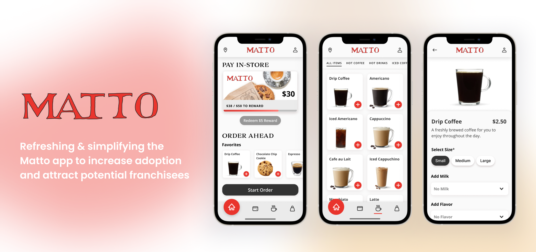
Matto is an espresso bar that aims to change the world by keeping things simple and fair, offering everything on its menu for only $2.50 while using its app and $2.75 bought in-store. Matto relies on its customer loyalty and competitive pricing to bring a robust value proposition to potential franchisees to keep a steady growth.*
I designed this app upgrade because I’m a Matto customer who uses the app to buy coffee. I created this project from inception to final design through research, ideation, and practicing UX design principles.
Duration: 8 weeks
Methods: Interviews, Wireframes, Prototyping, Testing
Tools: Figma, Adobe Illustrator
the Problem
How can we provide Matto users with a sleek shopping experience that fosters customer loyalty?
I want to help Matto implement features that keep its customers coming back for more to help support the growth of its franchise business.
first impressions
Assessing opportunities and threats
At this stage, I am looking to identify the problems with the app and who we are solving these problems for. I chose to do user observations, look at user feedback, and heuristic evaluation.
User Observation Findings:
After picking a store location, some users missed that the food/drink menu categories could be accessed by swiping to the left or right
Users were not able to accomplish adding in their payment info
Users were confused at the “pay in-store” button, which did not provide any function
User Feedback:
Apple App Store Rating
“Tried for over 30 min to add different cards with no success. Tried to use the form in the app to tell them I couldn't add a card and the form didn't even work. I downloaded and redownloaded twice and logged out and logged in several times and it still hasn't work. Extremely frustrating.”
“The way this app is set up is weird. I could not figure out how to pay and actually place an order. Will not be using further.”
“Placed order on Saturday, not knowing location was closed. Money immediately taken from my account. Attempted to reach out to customer service, there is none, had to leave my issue as feedback. Money eventually put back in account. Takes several days to get response from feedback. No point in having a mobile app if it does not know When a location is closed.”
Heuristic Evaluation:
Original Matto Espresso App Screens
Problems identified during heuristic evaluation:
Clunky and outdated UI
Poor presentation of information in many areas of the app including the Home page, Food/Drink Menu, and Rewards
Adding a payment method is extremely difficult to accomplish and needs more specific error states
Customer support form needs to prevent errors by asking for more specific details
Matto customer Personas
From my research, I’ve narrowed down the problems the customers are facing:
Users are unable to successfully add a payment method
Users find it difficult to navigate through the app and order
Users are unsatisfied with customer service form
Users are left confused after the order is placed
Most of this can be solved by:
Preventing and helping users diagnose and recover from errors
Simplifying the UI
Improving navigation
Ideating and prototyping
Creating a new information architecture
Using card sorting, I sorted and regrouped the navigation items. My main goal was to reorganize navigation to support the two main functions of the app, ordering for pickup and scanning the Matto loyalty card to pay in-store. I made the following changes:
Repurposed the “Home” page into a dashboard.
Condensed “Cards” and “Rewards” navigation pages into one, “Matto Card,” since reward money is only earned through purchases made using and uploading money to the Matto gift card.
Moved “Locations” navigation item to the top bar in the form of a map icon, and changed “Settings” gear to a “Profile” avatar icon.
wireframes
Medium Fidelity Wireframes & Testing
I created a working prototype of my wireframes and talked with the users I initially observed using the Matto app so I could make any usability fixes before building my final prototype. I asked to see:
Show me how you would order for pickup
Of the six participants, six of them utilized food/drink menu categories as opposed to the two that used them in the original version of the app
Show me how you would add a new payment method
Five of the six participants used the “Card” navigation tab on the bottom to look to add a payment card. The other used the Profile tab>My Matto Card.
the Final prototype
Placing an Online Order Flow
This flow shows you through the process of placing an online order using your new Matto account.
Start by tapping the “Start Order” button. You then will be guided through setting up your Matto Card with a new payment method and adding funds, choosing a Matto location, then picking your coffee from the menu and checking out.
More Projects:
My Resume
View in Figma or Download PDF Here →


